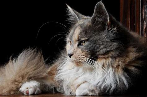
Dakota Johnson’s recent embrace of warm, earthy tones in her home decor suggests a significant shift away from the long-reigning popularity of beige and cool neutrals, signaling a potential trend towards what some are calling “ugly” colors dominating interior design in 2025. The actress’s eclectic living space, showcased in a recent Architectural Digest tour, has sparked conversations about whether traditionally unfashionable colors are poised to become the next big thing in home aesthetics.
Dakota Johnson, known for her acting career and increasingly for her distinctive personal style, has inadvertently become a trendsetter in the interior design world with her embrace of warm, earthy tones that some might deem “ugly.” Her Los Angeles home, recently featured in Architectural Digest, reveals a departure from the prevailing minimalist and neutral palettes that have dominated home décor for years. Instead, Johnson’s space is filled with shades of brown, mustard yellow, and other warm, earthy hues, suggesting a potential shift towards bolder, more unconventional color choices in 2025.
The rise of these so-called “ugly” colors isn’t necessarily about embracing genuinely unattractive shades, but rather about challenging conventional notions of beauty and sophistication in interior design. It’s a move away from the safe and predictable, towards more expressive and personality-driven spaces. Designers and homeowners are increasingly seeking ways to create unique environments that reflect their individual tastes and stand out from the crowd, and these warmer, earthier tones offer a way to achieve that. The “ugly” moniker is arguably a misnomer, as many find these shades comforting, nostalgic, and evocative of nature.
Johnson’s home exemplifies this trend. “I wanted to create a place where I felt calm,” she told Architectural Digest. Her design choices reflect a desire for comfort and authenticity over adhering to strict aesthetic rules. The prevalence of wood, leather, and natural textures further emphasizes this connection to the earth, contributing to the overall warmth and inviting atmosphere of the space. Her living room features a mix of vintage and contemporary pieces, creating a layered and lived-in feel. The color palette, while unconventional, works to unify the space and create a sense of harmony.
This move towards warmer, more saturated colors is also a reaction to the cool gray and minimalist trends that have been popular for so long. Many people are finding these spaces sterile and lacking in personality. The shift towards “ugly” colors represents a desire for more warmth, character, and individuality in the home. It’s about creating spaces that feel inviting, comfortable, and truly reflect the people who live in them.
Several factors are contributing to this emerging trend. Firstly, there’s a growing appreciation for vintage and retro design. The 1970s, in particular, are having a major influence on contemporary aesthetics, with their earthy color palettes, natural materials, and emphasis on comfort and relaxation. Secondly, there’s a growing awareness of the impact of color on mood and well-being. Warmer colors are often associated with feelings of comfort, security, and happiness, making them a natural choice for creating a welcoming home environment. Finally, there’s a growing desire for sustainability and eco-consciousness. Earthy tones evoke nature and can be easily paired with natural materials like wood, stone, and textiles, creating a sense of connection to the environment.
The trend extends beyond just residential spaces. Commercial environments, such as offices, restaurants, and retail stores, are also embracing warmer, more inviting color palettes. This shift is driven by a desire to create spaces that are not only functional but also aesthetically pleasing and conducive to well-being. For instance, a restaurant might use warm, earthy tones to create a cozy and inviting atmosphere, encouraging customers to linger and enjoy their meals. An office might use similar colors to promote relaxation and creativity among employees.
However, incorporating these so-called “ugly” colors into your home décor can be challenging. It requires a careful understanding of color theory and a willingness to experiment. It’s essential to consider the existing architecture and furnishings of your space and to choose colors that complement each other and create a sense of harmony. It’s also important to avoid overwhelming the space with too many bold colors. A good approach is to start with a neutral base and then add pops of color through accessories, artwork, and textiles.
Experts suggest that the key to successfully using these colors is to embrace the unexpected and to be confident in your choices. Don’t be afraid to experiment with different combinations and to find what works best for you. Ultimately, the goal is to create a space that reflects your personality and makes you feel happy and comfortable. “It’s about creating spaces that feel personal and authentic,” says one interior designer. “People are tired of cookie-cutter interiors and want to express themselves through their homes.”
The influence of Dakota Johnson’s style choices cannot be ignored. Her effortless cool and willingness to embrace unconventional looks have made her a style icon for many. Her home décor choices are simply an extension of her personal style, reflecting her appreciation for vintage, her love of natural materials, and her desire for comfort and authenticity. The fact that her home is being featured in Architectural Digest is a testament to her influence and the growing acceptance of this more eclectic and individualistic approach to interior design.
The predicted dominance of these “ugly” colors in 2025 doesn’t mean that everyone will suddenly abandon neutral palettes and embrace brown and mustard yellow. However, it does suggest a shift in attitudes towards color and a willingness to experiment with bolder, more unconventional choices. It’s about embracing individuality, challenging conventions, and creating spaces that truly reflect the people who live in them. Whether you love them or hate them, these “ugly” colors are poised to make a big impact on the world of interior design in the coming years. The trend aligns with a broader cultural movement towards authenticity and self-expression, as people seek to create spaces that are not only aesthetically pleasing but also meaningful and personal. It’s about creating homes that tell a story and reflect the unique experiences and personalities of their inhabitants.
The impact of social media on interior design trends is also significant. Platforms like Instagram and Pinterest have made it easier than ever to discover new ideas and to connect with designers and homeowners around the world. This increased accessibility to inspiration has led to a more diverse and experimental approach to home décor. People are no longer limited by traditional design rules and are more willing to take risks and try new things. The “ugly” color trend is a direct result of this increased experimentation and the desire to create spaces that stand out from the crowd. Social media also allows for trends to spread rapidly, amplifying the influence of celebrities and designers who are embracing these unconventional color choices.
Moreover, the psychological impact of color is increasingly being understood and considered in interior design. Color affects our mood, our energy levels, and our overall well-being. Warmer colors, such as brown, yellow, and orange, are often associated with feelings of comfort, security, and happiness. These colors can create a sense of warmth and intimacy in a space, making it feel more inviting and comfortable. Cooler colors, such as blue and green, are often associated with feelings of calmness and relaxation. While these colors can be beneficial in certain spaces, they can also feel sterile and impersonal if overused. The “ugly” color trend represents a move towards a more balanced and nuanced approach to color, one that takes into account the psychological impact of color and the need for warmth and comfort in the home.
The materials used in conjunction with these colors also play a crucial role. Natural materials, such as wood, leather, and stone, can enhance the warmth and earthiness of these colors. These materials also add texture and visual interest to a space, creating a more layered and dynamic look. In contrast, synthetic materials can sometimes clash with these colors, making them look cheap and artificial. The key is to choose materials that complement the colors and enhance the overall aesthetic of the space. For example, a brown leather sofa can be paired with a mustard yellow throw pillow to create a cozy and inviting living room. Or, a wooden dining table can be paired with terracotta-colored chairs to create a warm and inviting dining space.
Looking ahead, the “ugly” color trend is likely to continue to evolve and adapt. As people become more comfortable with these colors, they will likely find new and innovative ways to use them in their homes. We may see a wider range of “ugly” colors being embraced, as well as more sophisticated and nuanced approaches to color combinations. The key is to remain open-minded and to experiment with different ideas until you find what works best for you. Ultimately, the goal is to create a space that reflects your personality and makes you feel happy and comfortable. This trend suggests that design is becoming more democratic, with individuals feeling empowered to express their unique tastes and preferences, rather than adhering to rigid rules and expectations.
The contrast between the “ugly” color trend and the previously dominant minimalist aesthetic is stark. Minimalism emphasizes simplicity, functionality, and a neutral color palette. While minimalism can be visually appealing and create a sense of calm, it can also feel sterile and impersonal. The “ugly” color trend represents a rejection of this aesthetic in favor of something more expressive, personal, and warm. It’s about creating spaces that are not only aesthetically pleasing but also emotionally resonant. This doesn’t mean that minimalism is going away entirely, but it does suggest that people are looking for something more in their homes, something that reflects their individuality and makes them feel truly comfortable.
The impact on the paint industry is also noteworthy. Paint companies are already responding to the growing demand for warmer, earthier colors by releasing new palettes and collections that feature these shades. This is a clear indication that the “ugly” color trend is not just a fleeting fad but a significant shift in consumer preferences. Paint companies are also providing more resources and tools to help homeowners choose the right colors for their spaces, including online color visualizers and in-home color consultations. This increased support and guidance is making it easier for people to experiment with these colors and to create spaces that reflect their unique personalities.
In conclusion, Dakota Johnson’s embrace of warm, earthy tones is indicative of a larger trend towards more unconventional and expressive interior design choices. The so-called “ugly” color trend represents a rejection of sterile minimalism in favor of warmth, comfort, and individuality. It’s a trend driven by a variety of factors, including a growing appreciation for vintage design, an increased awareness of the psychological impact of color, and the influence of social media. While these colors may not be for everyone, they are poised to make a significant impact on the world of interior design in the coming years, challenging our notions of beauty and encouraging us to create spaces that truly reflect our personalities. The movement highlights a broader cultural shift towards embracing imperfection and celebrating individuality, which is reflected in the growing popularity of vintage and handcrafted items.
Frequently Asked Questions (FAQ)
-
What are “ugly” colors in the context of interior design?
In this context, “ugly” colors refer to warm, earthy tones like browns, mustards, olives, and other shades that have traditionally been considered unfashionable or dated in interior design. These colors are often associated with the 1970s and are now experiencing a resurgence in popularity as people seek more warmth and personality in their homes. It’s important to note that the term “ugly” is subjective and often used ironically to challenge conventional notions of beauty. The term suggests unconventional choices.
-
Why are these “ugly” colors becoming popular now?
Several factors contribute to their rising popularity: a reaction against the long-dominant cool gray and minimalist trends, a growing appreciation for vintage and retro aesthetics (particularly the 1970s), an increased awareness of the psychological impact of color (warmer colors evoke comfort and security), a desire for more personalized and expressive spaces, and the influence of social media showcasing these trends. A craving for authenticity and comfort is also a key driver.
-
How can I incorporate these “ugly” colors into my home without making it look dated or unattractive?
Start with a neutral base and add pops of color through accessories, artwork, and textiles. Consider the existing architecture and furnishings of your space and choose colors that complement each other. Use natural materials like wood, leather, and stone to enhance the warmth and earthiness of the colors. Don’t be afraid to experiment and find what works best for you. Focus on creating a balanced and harmonious space, and consider consulting with an interior designer for professional guidance. Think of it as creating a cohesive look rather than just slapping on the paint.
-
Is this “ugly” color trend just a fleeting fad, or is it here to stay?
While trends are always evolving, the shift towards warmer, more expressive colors seems to be more than just a temporary fad. It reflects a deeper cultural shift towards individuality, authenticity, and a rejection of sterile minimalism. While specific shades may come and go, the underlying desire for warmth, comfort, and personality in the home is likely to persist. This suggests that the core principles of this trend will continue to influence interior design for the foreseeable future. The increasing focus on sustainable and eco-conscious design, which often aligns with earthy color palettes, further reinforces the longevity of the trend.
-
What role did Dakota Johnson play in popularizing this “ugly” color trend?
Dakota Johnson’s home, recently featured in Architectural Digest, has inadvertently become a catalyst for the “ugly” color trend. Her embrace of warm, earthy tones in her living space has sparked conversations and inspired others to experiment with these unconventional colors. As a style icon with a large following, her design choices have a significant impact on popular culture and interior design trends. By showcasing her personal style and willingness to embrace the unexpected, she has helped to normalize and popularize these colors.
-
What other design elements complement these warm, earthy colors?
Natural materials like wood, leather, stone, and natural textiles such as linen and cotton work exceptionally well. Vintage or antique furniture pieces also add character and depth. Plants and greenery enhance the connection to nature, while textured rugs and throws create a cozy and inviting atmosphere. Mixing different textures and patterns can prevent the space from feeling flat and one-dimensional. Metal accents, such as brass or copper, can add a touch of sophistication and warmth.
-
How does the “ugly” color trend impact commercial spaces?
Commercial environments are increasingly embracing warmer, more inviting color palettes to create spaces that are not only functional but also aesthetically pleasing and conducive to well-being. Restaurants might use these tones to create a cozy and inviting atmosphere, while offices might use them to promote relaxation and creativity among employees. Retail stores can use these colors to create a welcoming and comfortable shopping experience. The goal is to create a space that is both visually appealing and emotionally resonant, enhancing the overall experience for customers and employees.
-
What are some specific examples of “ugly” colors being used effectively in interior design?
Examples include a living room with walls painted in a muted olive green, paired with a brown leather sofa and mustard yellow throw pillows. Another example is a dining room with terracotta-colored walls, a wooden dining table, and chairs upholstered in a warm, earthy fabric. A bedroom could feature walls painted in a warm beige or brown, with bedding in shades of rust and ochre. The key is to create a cohesive and balanced look by carefully selecting colors and materials that complement each other.
-
How can I avoid making my home look outdated when using these colors?
The key is to avoid replicating the design trends of the 1970s exactly. Instead, use these colors in a modern and contemporary way. Pair them with clean lines, minimalist furniture, and modern accessories. Avoid overly ornate or fussy details. Focus on creating a space that feels fresh and updated, rather than dated and old-fashioned. Incorporating modern lighting and technology can also help to create a contemporary feel.
-
What is the psychological impact of these “ugly” colors on mood and well-being?
Warmer colors, such as brown, yellow, and orange, are often associated with feelings of comfort, security, and happiness. These colors can create a sense of warmth and intimacy in a space, making it feel more inviting and comfortable. They can also evoke feelings of nostalgia and connection to nature. By using these colors in your home, you can create a space that promotes relaxation, well-being, and a sense of emotional connection. The earth tones also help to ground and center individuals within their living spaces.
-
How does this trend connect with sustainability and eco-consciousness?
Earthy tones evoke nature and can be easily paired with natural materials like wood, stone, and textiles, creating a sense of connection to the environment. Many of these colors can be derived from natural pigments, which are more sustainable and environmentally friendly than synthetic dyes. By using these colors in your home, you can create a space that is not only aesthetically pleasing but also aligned with your values of sustainability and eco-consciousness. The emphasis on natural materials further reinforces the connection to the environment.
-
What are some common mistakes to avoid when using these colors?
One common mistake is using too many bold colors in a small space, which can make it feel overwhelming and claustrophobic. Another mistake is not considering the existing architecture and furnishings of your space, which can lead to clashes and disharmony. It’s also important to avoid using too many synthetic materials, which can make the colors look cheap and artificial. Finally, it’s important to avoid replicating design trends of the past exactly, which can make the space look outdated and old-fashioned. Planning and careful consideration of all elements are key.
-
How does the rise of social media influence interior design trends like this one?
Social media platforms like Instagram and Pinterest have made it easier than ever to discover new ideas and to connect with designers and homeowners around the world. This increased accessibility to inspiration has led to a more diverse and experimental approach to home décor. People are no longer limited by traditional design rules and are more willing to take risks and try new things. Social media also allows for trends to spread rapidly, amplifying the influence of celebrities and designers who are embracing these unconventional color choices. The visual nature of these platforms makes them ideal for showcasing and promoting interior design trends.
-
What are paint companies doing to respond to the demand for these colors?
Paint companies are already responding to the growing demand for warmer, earthier colors by releasing new palettes and collections that feature these shades. They are also providing more resources and tools to help homeowners choose the right colors for their spaces, including online color visualizers and in-home color consultations. This increased support and guidance is making it easier for people to experiment with these colors and to create spaces that reflect their unique personalities. The creation of specialized paint formulas and finishes that enhance the depth and richness of these colors is also a key response.
-
How can I find inspiration for using these colors in my home?
Look for inspiration on social media platforms like Instagram and Pinterest. Browse interior design magazines and websites. Visit local furniture stores and showrooms. Attend home shows and design events. Consult with an interior designer. The key is to gather as much information and inspiration as possible before making any decisions. Pay attention to the specific shades, materials, and furniture styles that appeal to you. Create a mood board to visualize your ideas and ensure that they are cohesive.
-
How do different lighting conditions affect the appearance of these colors?
Lighting plays a crucial role in how colors appear in a space. Natural light tends to enhance the warmth and vibrancy of these colors, while artificial light can sometimes alter their appearance. It’s important to consider the type of lighting you have in your home and how it will affect the colors you choose. Experiment with different types of light bulbs to find the ones that best complement your color palette. Also, keep in mind that colors can appear different at different times of the day, depending on the amount of natural light that is available.
-
What types of furniture styles work best with these colors?
Vintage or antique furniture pieces add character and depth to a space with warm, earthy tones. Mid-century modern furniture, with its clean lines and organic shapes, also works well. Bohemian-style furniture, with its eclectic mix of textures and patterns, can create a cozy and inviting atmosphere. The key is to choose furniture styles that complement the colors and enhance the overall aesthetic of the space. Avoid overly ornate or fussy furniture styles, which can clash with the warmth and simplicity of these colors.
-
Are there any specific demographics that are more drawn to this trend?
While the “ugly” color trend appeals to a wide range of people, it is particularly popular among millennials and Gen Z. These generations are often more open to experimentation and self-expression, and they are more likely to embrace unconventional trends. They are also more likely to be influenced by social media and celebrity endorsements. However, the trend is also gaining traction among older generations who are looking to create more personalized and comfortable homes. The desire for warmth, comfort, and individuality is a universal one that transcends age and demographic boundaries.
-
How does this trend relate to the broader cultural movement towards authenticity and self-expression?
The “ugly” color trend is a reflection of a broader cultural movement towards authenticity and self-expression. People are increasingly seeking to create spaces that reflect their unique personalities and values, rather than adhering to rigid rules and expectations. They are also more willing to embrace imperfection and celebrate individuality. This trend is a way for people to express themselves and create spaces that feel truly personal and authentic. It’s about creating homes that tell a story and reflect the unique experiences and personalities of their inhabitants.
-
Where can I find designers who specialize in incorporating these colors into their work?
Search online directories of interior designers, such as those provided by professional organizations like the American Society of Interior Designers (ASID). Look for designers who showcase their work on social media platforms like Instagram and Pinterest. Attend local design events and home shows to meet designers and see their work in person. Ask for referrals from friends and family. When choosing a designer, be sure to review their portfolio and talk to them about your vision and goals. Finding a designer who understands your style and is experienced in working with these colors is crucial.