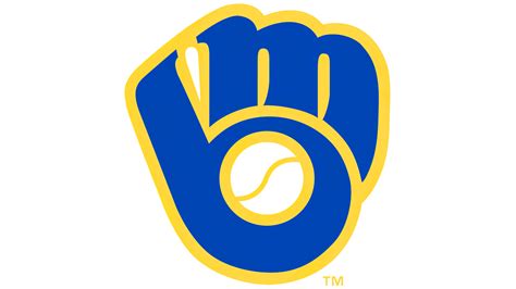
A clever piece of baseball trivia made its way onto the “Jeopardy!” stage, highlighting the hidden design within the Milwaukee Brewers’ logo – a baseball glove forming the letters “M” and “B.” The clue stumped one contestant, drawing attention to the logo’s intricate and often overlooked design element, which has been a part of the team’s identity for decades.
The “Jeopardy!” clue, which appeared on a recent episode, focused on identifying the Major League Baseball team whose logo cleverly incorporated both the team’s initials and the image of a baseball glove. While two contestants correctly identified the Brewers, one contestant was unable to decipher the clue, sparking a renewed interest in the logo’s design. The Brewers themselves acknowledged the “Jeopardy!” appearance on social media, further amplifying the buzz surrounding their iconic symbol. The team wrote in a post, “The Brewers logo was a @Jeopardy clue tonight! How did our contestants do?”
The logo, originally introduced in 1978, was designed by University of Wisconsin-Eau Claire art student Tom Meindel. It’s a testament to effective design, seamlessly blending the team’s initials into a recognizable image related to the sport. This hidden element has been a source of fascination for baseball fans and design enthusiasts alike, making its appearance on “Jeopardy!” a fitting tribute to its enduring appeal.
The Milwaukee Brewers Logo: A Design Legacy
The Milwaukee Brewers logo, renowned for its clever integration of the team’s initials “M” and “B” into the shape of a baseball glove catching a ball, has been a significant part of the team’s visual identity for over four decades. Designed in 1977 and officially adopted in 1978, the logo was the brainchild of Tom Meindel, then an art student at the University of Wisconsin-Eau Claire. Meindel’s design beat out numerous other submissions, capturing the essence of the team and the sport in a single, memorable image.
Meindel, in a 2018 interview with the Milwaukee Journal Sentinel, reflected on the design process, stating, “The assignment was to create a logo that incorporated both the Brewers’ initials and a baseball glove. I just started sketching, trying different ways to make it work. It was a lot of trial and error, but eventually, I came up with the design that everyone knows today.”
The logo’s success lies in its simplicity and effectiveness. The orange baseball nestled in the glove adds a splash of color and instantly identifies the sport. The use of negative space to form the “M” and “B” is a design technique that rewards closer inspection, making the logo engaging and memorable. This clever use of negative space contributes significantly to the logo’s lasting appeal.
The Brewers organization has long recognized the significance of the logo. As former Brewers owner Bud Selig noted, “The logo has become synonymous with the Brewers. It’s a part of our history, and it represents the connection between the team and the fans.”
Jeopardy! Appearance Ignites Renewed Interest
The recent “Jeopardy!” clue served as a reminder of the logo’s enduring appeal and sparked a wave of nostalgia and appreciation among baseball fans and design enthusiasts. The clue itself was carefully crafted to highlight the logo’s hidden design elements.
The category was “Logo Landmarks,” and the clue read: “This Major League Baseball team’s logo forms both its initials and a piece of sports equipment.” While two contestants correctly answered with the Milwaukee Brewers, the third contestant’s inability to identify the logo brought it back into the spotlight. Social media platforms buzzed with comments and discussions about the design, with many users expressing surprise at having never noticed the hidden initials before.
The Brewers capitalized on the “Jeopardy!” appearance, sharing a clip of the segment on their social media channels. The post generated thousands of likes, shares, and comments, demonstrating the logo’s continued relevance in the digital age. Fans reminisced about their first memories of seeing the logo, sharing stories about attending Brewers games as children and collecting team memorabilia.
Sports marketing experts suggest that the “Jeopardy!” moment could provide a minor, indirect boost to Brewers merchandise sales and overall brand recognition. “Any time a brand can get organic exposure on a platform like ‘Jeopardy!,’ it’s a win,” said Mark Williams, a sports marketing consultant. “It reminds people of the brand and reinforces its identity in a positive way.”
Evolution of the Brewers Logo
While the “ball-in-glove” logo is the most recognizable symbol of the Milwaukee Brewers, the team has undergone several logo changes throughout its history. Before the iconic glove design, the Brewers featured a logo depicting a cartoonish beer barrel man, a nod to Milwaukee’s brewing heritage.
The original Brewers team, which played in the American League in 1901, used a simple block letter “M” as their primary logo. When the team was re-established in 1970, after the Seattle Pilots relocated to Milwaukee, the team initially retained a similar “M” logo, but quickly transitioned to the beer barrel man.
The beer barrel man logo, while charming, was deemed somewhat outdated by the late 1970s. The team sought a more modern and dynamic logo that would appeal to a broader audience. This led to the creation of the “ball-in-glove” design, which proved to be a resounding success.
In 1994, the Brewers introduced a new logo set that included a stylized “M” with barley stalks, paying homage to the city’s brewing history. While this logo was used on some team merchandise and marketing materials, the “ball-in-glove” remained the primary logo.
In 2020, the Brewers unveiled a refreshed logo set that retained the “ball-in-glove” design but updated the color scheme and typography. The new logo set features a darker shade of navy blue and a cream color that is reminiscent of old baseball uniforms. The team also introduced a new alternate logo featuring a barley stalk intertwined with the letter “M.”
Despite these changes, the “ball-in-glove” logo has remained a constant presence throughout the Brewers’ history. Its enduring popularity is a testament to its clever design and its ability to connect with fans on an emotional level.
The Designer: Tom Meindel
Tom Meindel’s creation of the Brewers logo is a remarkable story of a student designer making a lasting impact. At the time of the design competition, Meindel was a graphic design student at the University of Wisconsin-Eau Claire. His winning design not only became the face of the Milwaukee Brewers but also launched his career in the field of design.
Meindel, in later interviews, has expressed surprise at the logo’s enduring legacy. He has described the design process as a combination of inspiration and hard work. “I remember spending hours sketching different ideas and trying to find a way to make the ‘M’ and ‘B’ look like a glove,” Meindel said. “It was a challenging project, but I’m proud of the final result.”
After graduating from college, Meindel worked as a graphic designer for several companies before starting his own design firm. He has continued to work in the field of design, creating logos and branding materials for a variety of clients.
Meindel’s story serves as an inspiration to aspiring designers, demonstrating that even a student can create a design that has a lasting impact. His Brewers logo is a prime example of how effective design can elevate a brand and connect with audiences on an emotional level.
The Impact on Milwaukee
The Brewers logo is more than just a symbol of a baseball team; it’s an integral part of Milwaukee’s cultural identity. The logo is featured prominently throughout the city, adorning buildings, merchandise, and even public art installations.
The Brewers are deeply ingrained in the fabric of Milwaukee, and the logo serves as a visual representation of that connection. The team’s success on the field has brought pride and excitement to the city, and the logo has become a symbol of that shared experience.
The Brewers’ presence in Milwaukee also has a significant economic impact. The team’s games generate millions of dollars in revenue for local businesses, and the team’s charitable foundation supports numerous community organizations. The Brewers are a vital part of Milwaukee’s economy and its social fabric.
The “ball-in-glove” logo has become synonymous with Milwaukee, much like the Golden Gate Bridge is with San Francisco or the Statue of Liberty is with New York City. It’s a visual shorthand for the city and its people, representing their passion for baseball and their unwavering support for the Brewers.
The city of Milwaukee honored Meindel in 2018, the 40th anniversary of the logo’s debut, recognizing his contribution to the city’s identity. The Brewers organization also celebrated the anniversary with special events and promotions.
Other Hidden Logo Designs
The Milwaukee Brewers logo is not the only example of a logo that incorporates hidden design elements. Many other companies and organizations use similar techniques to create logos that are both visually appealing and intellectually engaging.
One notable example is the FedEx logo, which features a hidden arrow in the negative space between the “E” and the “x.” This arrow is said to represent the company’s speed and efficiency in delivering packages.
Another example is the Toblerone logo, which features a bear hidden in the image of the Matterhorn mountain. The bear is a symbol of the city of Bern, Switzerland, where Toblerone was founded.
The Baskin-Robbins logo includes the number “31” subtly embedded within the “B” and “R,” representing the company’s original offering of 31 different flavors of ice cream.
These hidden design elements add an extra layer of meaning to the logos, making them more memorable and engaging for viewers. They also demonstrate the creativity and skill of the designers who created them.
The use of hidden design elements is a popular technique in logo design because it allows designers to communicate multiple messages in a single image. It also rewards viewers who take the time to look closely at the logo, creating a sense of discovery and appreciation.
The Future of the Brewers Logo
The Milwaukee Brewers have a long and storied history, and the “ball-in-glove” logo has been a constant presence throughout much of that history. While the team has made some minor adjustments to the logo over the years, the basic design has remained unchanged.
It’s likely that the Brewers will continue to use the “ball-in-glove” logo for many years to come. The logo is deeply ingrained in the team’s identity and is beloved by fans. It’s a timeless design that continues to resonate with audiences of all ages.
However, it’s also possible that the Brewers could eventually decide to update the logo again. Trends in logo design are constantly evolving, and the team may feel the need to modernize its visual identity to stay relevant.
If the Brewers do decide to update the logo, it’s unlikely that they would abandon the “ball-in-glove” design entirely. The logo is too iconic and too closely associated with the team. Instead, they would likely make subtle changes to the design, such as updating the color scheme or the typography.
Regardless of what the future holds, the “ball-in-glove” logo will always be remembered as a classic example of effective logo design. It’s a testament to the power of simplicity, creativity, and the ability to connect with audiences on an emotional level.
The logo’s appearance on “Jeopardy!” serves as a reminder of its enduring appeal and its place in baseball history. It’s a symbol that represents the Milwaukee Brewers, the city of Milwaukee, and the passion of baseball fans everywhere.
Conclusion
The Milwaukee Brewers’ “ball-in-glove” logo, designed by Tom Meindel, stands as a remarkable example of effective and enduring logo design. Its clever integration of the team’s initials into the shape of a baseball glove has captivated fans for decades. The recent spotlight on “Jeopardy!” only served to reinforce the logo’s iconic status and its ability to connect with audiences on an emotional level. From its humble beginnings as a student project to its prominent place in Milwaukee’s cultural landscape, the logo has become synonymous with the Brewers and the city itself, proving that great design can truly stand the test of time. The logo’s enduring legacy is a testament to Meindel’s creativity and the Brewers’ commitment to a symbol that resonates with their fans.
Frequently Asked Questions (FAQ)
-
Who designed the Milwaukee Brewers “ball-in-glove” logo?
The logo was designed by Tom Meindel, who was an art student at the University of Wisconsin-Eau Claire in 1977.
-
When was the logo first introduced?
The logo was officially adopted by the Milwaukee Brewers in 1978.
-
What is unique about the design of the Brewers logo?
The logo cleverly incorporates the team’s initials, “M” and “B,” into the shape of a baseball glove catching a ball. This hidden design element is often overlooked but adds to the logo’s appeal.
-
How did the Milwaukee Brewers acknowledge the “Jeopardy!” appearance?
The Brewers shared a clip of the “Jeopardy!” segment on their social media channels, sparking a wave of nostalgia and appreciation among fans.
-
Has the Brewers logo changed much over time?
While the Brewers have made some minor adjustments to the logo over the years, such as updating the color scheme and typography, the basic “ball-in-glove” design has remained unchanged, solidifying its status as a timeless classic.