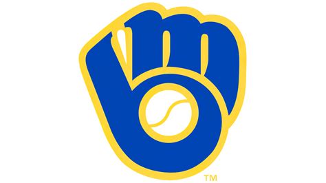
A subtle design element embedded within the Milwaukee Brewers’ iconic ball-in-glove logo has remained largely unnoticed for decades, even stumping contestants on the popular game show Jeopardy!, highlighting the logo’s clever and enduring appeal. The logo, featuring a baseball nestled within a catcher’s mitt, cleverly forms the letters “MB” for Milwaukee Brewers, a detail that has escaped the attention of many fans and observers.
The Brewers’ logo, a symbol of the team since 1978, was highlighted in a recent Jeopardy! clue, prompting widespread discussion and renewed appreciation for its intricate design. While the clue referenced the logo’s ability to form the team’s initials, many viewers and even contestants were unaware of this hidden feature. The Jeopardy! appearance has sparked a wave of online commentary, with fans expressing surprise and admiration for the logo’s subtle complexity.
The Brewers’ logo wasn’t always the current design. Before the famous ball-in-glove, the team’s logo from 1970-1977 was a comical beer barrel man sliding into home plate, dubbed “Bernie Brewer.” This reflected the team’s original owner’s association with a brewery. The shift to the ball-in-glove logo marked a transition to a more sophisticated and enduring brand identity.
The logo’s creation is credited to Tom Meindel, a then-26-year-old art student. Meindel’s design beat out hundreds of submissions in a team-organized competition. “It’s very rewarding to know that it’s been around this long,” Meindel said in previous interviews regarding his creation. The logo was first unveiled in November 1977 and officially adopted for the 1978 season.
The logo has seen minor modifications over the years, but the core design principle has remained consistent. The color palette has been updated to reflect the team’s evolving branding, but the core element of the “MB” formed within the baseball glove has been preserved.
The Milwaukee Brewers’ logo is not just a symbol of the team; it’s a piece of Milwaukee history. Its enduring appeal lies in its clever design and its ability to connect with fans on multiple levels. The recent Jeopardy! appearance has served as a reminder of the logo’s unique charm and its place in baseball lore. It represents a subtle but effective piece of branding that has stood the test of time, continuing to surprise and delight fans decades after its creation. This speaks to the power of good design and its ability to create lasting impressions.
Beyond the aesthetic appeal, the logo holds significant brand value for the Brewers. It is instantly recognizable and is used extensively on merchandise, advertising, and team communications. The logo represents the team’s identity and serves as a visual shorthand for the Brewers franchise. Its enduring presence has helped to build brand recognition and loyalty among fans.
The logo’s effectiveness stems from its simplicity and its ability to communicate multiple messages simultaneously. It clearly identifies the team as a baseball team, references its location (Milwaukee), and incorporates the team’s initials in a clever and memorable way. The design is also visually appealing, with a classic and timeless quality that has helped it to remain relevant over the years.
The fact that the logo’s hidden “MB” design has remained a secret to many for so long speaks to the subtlety and sophistication of the design. It is not immediately obvious, but once noticed, it is hard to unsee. This element of discovery adds to the logo’s appeal and makes it a source of continued fascination for fans.
The Milwaukee Brewers’ ball-in-glove logo is more than just a symbol; it’s a testament to the power of good design and its ability to create lasting impressions. Its enduring appeal, its clever hidden feature, and its prominent role in the team’s branding all contribute to its status as one of the most iconic logos in baseball. The Jeopardy! appearance has only served to reinforce this status and to remind fans of the logo’s unique charm.
The logo’s success also highlights the importance of strong brand identity in professional sports. In a crowded marketplace, a distinctive and memorable logo can help a team to stand out and to build a loyal fan base. The Brewers’ logo has played a key role in the team’s branding efforts and has helped to solidify its place in the hearts of Milwaukee baseball fans.
The story of the Brewers’ logo is a reminder that even seemingly simple designs can contain hidden depths and that the best logos are those that communicate multiple messages in a clear and memorable way. It is a testament to the creativity of the designer, Tom Meindel, and to the enduring power of good design. The “MB” in the glove is a hidden gem, a detail that continues to surprise and delight fans, and a reminder that the best logos are often those that reveal their secrets over time.
The impact of the Jeopardy! clue extends beyond mere trivia; it has rekindled a sense of appreciation for the team’s history and branding. Social media platforms have been flooded with comments and discussions about the logo, with many fans sharing their own stories and memories related to the Brewers. This renewed interest has helped to further solidify the logo’s place in the team’s identity and in the collective memory of its fans.
The story of the Brewers’ logo also serves as a valuable lesson for designers and marketers. It demonstrates the importance of creating designs that are both visually appealing and conceptually sound, and that are able to communicate multiple messages effectively. The “MB” in the glove is a perfect example of how a subtle detail can add depth and meaning to a design, and how a well-designed logo can become an enduring symbol of a brand.
In conclusion, the Milwaukee Brewers’ ball-in-glove logo is a triumph of design. Its enduring appeal, its clever hidden feature, and its prominent role in the team’s branding all contribute to its status as one of the most iconic logos in baseball. The Jeopardy! appearance has only served to reinforce this status and to remind fans of the logo’s unique charm. It is a testament to the power of good design and its ability to create lasting impressions. The team has embraced its history and brand, continuing to use the logo prominently in all aspects of the franchise.
The subtle brilliance of the Milwaukee Brewers’ logo lies not only in its aesthetic appeal but also in its clever integration of the team’s initials. The “MB” formed by the baseball nestled in the glove is a prime example of effective visual communication, showcasing how a simple design can convey multiple layers of meaning. This hidden detail, which has eluded many for decades, highlights the ingenuity behind the logo and its enduring impact on the team’s identity.
The recent Jeopardy! appearance, where contestants struggled to identify the hidden initials, underscored the logo’s subtle complexity. This moment sparked a renewed appreciation for the logo among fans and observers alike, reaffirming its status as a design masterpiece. The widespread discussion generated by the Jeopardy! clue demonstrates the logo’s ability to captivate and engage, even after more than four decades of use.
The creation of the Brewers’ logo in 1978 marked a significant turning point in the team’s branding strategy. Prior to the ball-in-glove design, the team’s logo featured “Bernie Brewer,” a beer barrel man sliding into home plate, reflecting the team’s original ownership’s ties to the brewing industry. The transition to the more sophisticated and timeless ball-in-glove logo signaled a shift towards a more professional and enduring brand identity.
Tom Meindel, the designer behind the iconic logo, was a 26-year-old art student when his design was selected from hundreds of submissions in a team-organized competition. Meindel’s creation has stood the test of time, becoming an integral part of the Brewers’ identity and a symbol of the city of Milwaukee. His design is a testament to the power of simplicity and the importance of effective visual communication.
While the Brewers’ logo has undergone minor modifications over the years, the core design principle has remained unchanged. The color palette has been updated to reflect the team’s evolving branding, but the “MB” formed within the baseball glove has been consistently preserved. This consistency has helped to maintain the logo’s recognition and its connection with fans.
The Milwaukee Brewers’ logo is more than just a symbol of the team; it is a piece of Milwaukee’s cultural heritage. Its enduring appeal lies in its clever design, its subtle complexity, and its ability to connect with fans on an emotional level. The recent Jeopardy! appearance has served as a reminder of the logo’s unique charm and its place in baseball lore.
The logo’s effectiveness is rooted in its ability to communicate multiple messages simultaneously. It clearly identifies the team as a baseball team, references its location (Milwaukee), and incorporates the team’s initials in a clever and memorable way. The design is also visually appealing, with a classic and timeless quality that has helped it to remain relevant over the years.
The fact that the logo’s hidden “MB” design has remained a secret to many for so long is a testament to the subtlety and sophistication of the design. It is not immediately obvious, but once noticed, it is hard to unsee. This element of discovery adds to the logo’s appeal and makes it a source of continued fascination for fans.
The Milwaukee Brewers’ ball-in-glove logo is a powerful example of how good design can create lasting impressions. Its enduring appeal, its clever hidden feature, and its prominent role in the team’s branding all contribute to its status as one of the most iconic logos in baseball. The Jeopardy! appearance has only served to reinforce this status and to remind fans of the logo’s unique charm.
The logo’s success also underscores the importance of strong brand identity in professional sports. In a competitive market, a distinctive and memorable logo can help a team to stand out and to build a loyal fan base. The Brewers’ logo has played a crucial role in the team’s branding efforts and has helped to solidify its place in the hearts of Milwaukee baseball fans.
The story of the Brewers’ logo is a reminder that even seemingly simple designs can contain hidden depths and that the best logos are those that communicate multiple messages in a clear and memorable way. It is a testament to the creativity of the designer, Tom Meindel, and to the enduring power of good design. The “MB” in the glove is a hidden gem, a detail that continues to surprise and delight fans, and a reminder that the best logos are often those that reveal their secrets over time.
The impact of the Jeopardy! clue extends beyond mere trivia; it has rekindled a sense of appreciation for the team’s history and branding. Social media platforms have been buzzing with comments and discussions about the logo, with many fans sharing their own stories and memories related to the Brewers. This renewed interest has helped to further solidify the logo’s place in the team’s identity and in the collective memory of its fans.
The story of the Brewers’ logo also serves as a valuable lesson for designers and marketers. It demonstrates the importance of creating designs that are both visually appealing and conceptually sound, and that are able to communicate multiple messages effectively. The “MB” in the glove is a perfect example of how a subtle detail can add depth and meaning to a design, and how a well-designed logo can become an enduring symbol of a brand.
Furthermore, the logo exemplifies the importance of considering longevity in design. Trends come and go, but a truly iconic logo transcends fleeting fads. The Brewers logo, with its classic aesthetic and hidden depth, has proven its ability to remain relevant and engaging across generations. This is a testament to its timeless quality and the careful consideration given to its design.
The Brewers’ logo has also become a valuable asset for the team’s merchandising efforts. The logo is prominently featured on a wide range of products, from apparel to souvenirs, generating significant revenue for the team. The logo’s strong recognition and positive associations make it a desirable symbol for fans to display, further solidifying its value to the organization.
In recent years, there has been a growing trend among sports teams to modernize their logos and branding. While some teams have successfully updated their identities, others have faced criticism for straying too far from their traditional roots. The Brewers, however, have wisely chosen to maintain the core elements of their iconic logo, recognizing its enduring appeal and its connection to the team’s history. This decision reflects a commitment to preserving the team’s heritage while also embracing contemporary design principles.
In conclusion, the Milwaukee Brewers’ ball-in-glove logo is a triumph of design that has stood the test of time. Its enduring appeal, its clever hidden feature, and its prominent role in the team’s branding all contribute to its status as one of the most iconic logos in baseball. The Jeopardy! appearance has only served to reinforce this status and to remind fans of the logo’s unique charm. It is a testament to the power of good design and its ability to create lasting impressions.
Frequently Asked Questions (FAQ)
Q1: What is the hidden feature in the Milwaukee Brewers’ ball-in-glove logo?
A1: The hidden feature is that the baseball nestled within the catcher’s mitt cleverly forms the letters “MB,” which stand for Milwaukee Brewers. This subtle detail has remained largely unnoticed by many fans for decades.
Q2: Who designed the Milwaukee Brewers’ ball-in-glove logo?
A2: Tom Meindel, a then-26-year-old art student, designed the logo. His design was selected from hundreds of submissions in a team-organized competition.
Q3: When was the ball-in-glove logo introduced?
A3: The logo was first unveiled in November 1977 and officially adopted for the 1978 season. It replaced the previous logo featuring “Bernie Brewer,” a beer barrel man sliding into home plate.
Q4: How did the Jeopardy! game show highlight the Brewers’ logo?
A4: A recent Jeopardy! clue referenced the logo’s ability to form the team’s initials, prompting widespread discussion and renewed appreciation for its intricate design. Many viewers and even contestants were unaware of this hidden feature, leading to increased attention and admiration for the logo.
Q5: Has the Brewers’ ball-in-glove logo changed significantly over the years?
A5: While the logo has seen minor modifications over the years, the core design principle of the “MB” formed within the baseball glove has remained consistent. The color palette has been updated to reflect the team’s evolving branding, but the essential design has been preserved.